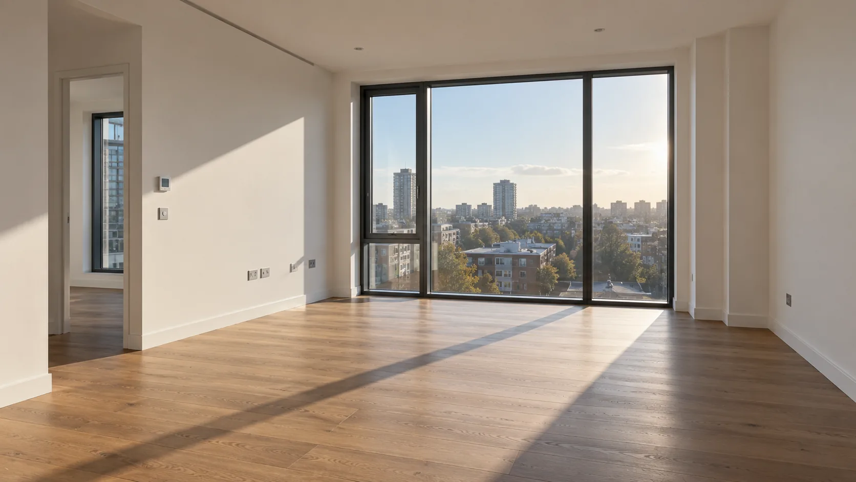
Selling an unbuilt apartment requires the buyer to imagine living in a space that does not exist. Interior visualization is how that imagination is supplied — and for developers marketing off-plan, it is frequently the single most consequential piece of collateral in the campaign.
Done carelessly it produces generic images that could depict any scheme anywhere. Done well it communicates something specific and true about the product.
Two distinct services
Virtual staging applies furniture, finishes, and styling to a photograph of an existing empty room. The room is real; the contents are added digitally. Common in resale and lettings, and in completed-but-unsold new build.
Interior visualization renders the entire scene from a model, including the architecture. Used for off-plan sales where the space does not yet exist.
They differ operationally. Virtual staging is constrained by the photograph — the camera position, the lighting, and the room as built are fixed. Interior visualization controls everything, which is more work and more flexible.
Why developers use it
Timing. Marketing typically begins long before completion. Sales rates in the early period materially affect a scheme's finance costs, and visualization is what makes early sales possible.
Cost against physical staging. Furnishing show units is expensive per unit and cannot be applied to every unit type. Virtual treatment covers the full mix.
Coverage of the mix. A scheme with eight unit types can be shown across all eight, and in multiple styling directions, at a fraction of the cost of one physical show home.
Iteration. Styling that is not converting can be revised in days.
Aspect and outlook. Views from each unit can be shown accurately from the actual floor level and orientation, which is one of the most decision-relevant pieces of information a buyer receives and one of the most commonly faked.
Getting the space right before the styling
The most frequent defect in interior visualization is furniture that lies about scale. A sofa rendered slightly small makes a room appear larger, and the buyer discovers the truth at handover. Beyond being dishonest, it produces complaints and, in some markets, regulatory exposure.
Discipline that prevents it:
- Real product dimensions. Furniture assets should carry actual manufacturer dimensions, not approximations sized to fit.
- Standard bed sizes shown as such. A double is a double; showing one at reduced scale in a bedroom is the most common single manipulation in the sector.
- Circulation shown honestly. Clearances around beds and dining tables should be real.
- Camera lens honesty. Extremely wide lenses distort spatial perception dramatically. Using a lens equivalent to natural perspective, and stating the focal length, is the defensible approach.
- Ceiling height correct to the design, including any bulkheads and services zones that will actually be there.
A useful internal test: place a human figure at standard height in the scene during review. Scale errors become obvious immediately.
Windows, views, and outlook
The view from the window is often the most valuable and most misrepresented element.
Where possible, the outlook should be derived from the actual site — from context modeling, from photography taken at the correct level and orientation, or from a combination. A generic sky or a stock cityscape in a unit that will face a neighbouring wall is the kind of misrepresentation that undermines an entire campaign when buyers visit.
Where the accurate view is unattractive, the correct response is to show it and compete on something else, or to be explicit that the image shows an indicative outlook.
Materials and specification alignment
Images should show the actual specification. When the marketing render shows engineered oak flooring and the delivered unit has laminate, the developer has created a problem that no disclaimer fully resolves.
Working practice:
- Source material references from the actual specification, with manufacturer product codes
- Update the visualization when the specification changes through value engineering
- Where alternatives are offered as options, produce images of each rather than a blend
- Where a finish is genuinely undecided, show it neutrally and say so
Styling direction
Styling should reflect the target buyer, and a scheme selling across several buyer profiles benefits from more than one direction. Common approaches:
- Neutral and light — broadest appeal, lowest risk, and the safest choice where the buyer profile is uncertain
- Warm and textured — reads as domestic and comfortable; suits family and downsizer product
- Sharp and contemporary — suits investor and young professional product
- Characterful and specific — highest risk and highest differentiation; appropriate for distinctive schemes where generic imagery would undersell the design
Over-styling is a recurring error. Images crowded with props and heavy art direction read as a magazine shoot rather than as a home, and buyers discount them.
Building a reusable asset library
For a multi-phase or multi-unit scheme, the economics improve substantially with a maintained library:
- Furniture and accessory assets at correct scale, tagged by style direction
- Material library matched to the actual specification
- Lighting setups per orientation — north-facing rooms lit as north-facing rooms
- Context and outlook assets per elevation and level
Built once, this converts each additional unit type into a scene assembly rather than a fresh production. Across a scheme of any size, the library is where the cost saving lives.
Disclosure and compliance
Requirements vary by jurisdiction, and developers should take advice specific to their market. The consistent principles are:
- Virtually staged images should be identified as such
- Furniture shown should be identified as not included, where it is not
- Images described as indicative should say so, legibly rather than in fine print
- Specification shown should match what is contracted, or the difference should be stated
Property marketing is regulated in most markets, and misleading imagery carries real consequences. Beyond compliance, the commercial argument is straightforward: a buyer who feels misled at handover is a complaint, a reputational risk, and in some cases a rescission.
Lighting that reads as real
Interior images fail more often on lighting than on furniture. The corrections are consistent:
Light each room for its actual orientation. A north-facing room lit with warm directional sun is immediately wrong to anyone who has lived in one. Orientation-correct lighting is one of the few things that quietly signals the images are honest.
Use realistic exterior levels. Interiors photographed against a bright exterior show a blown-out window, and images that render the outside perfectly exposed while the interior is also perfectly exposed read as artificial.
Include the specified light fittings. Where downlights, pendants, or coves are part of the specification, they should appear and should be doing something.
Show the time of day consistently across a set. A campaign mixing morning, afternoon, and dusk images across unit types looks assembled rather than designed.
Keep contrast honest. Deep, flattering shadow can conceal a low ceiling or an awkward proportion. If a room has a difficult feature, the image should show it and the design should address it.
Delivering a set that works across channels
A scheme's imagery is used in more places than the brochure, and specifying only one output creates rework.
Plan the deliverable set:
- Print — high resolution, CMYK-ready, with bleed where required
- Web and portal — optimised sizes for the property portals the scheme will list on, each with its own aspect ratio requirements
- Social — square and vertical crops, composed rather than cropped mechanically from a landscape image
- Sales suite display — large-format, viewed close, so resolution and material detail matter
- Site hoarding — very large format viewed at distance, where simplicity beats detail
Composing the original views with the crops in mind — leaving space where a vertical crop will be taken — costs nothing at the outset and prevents images that lose their subject when reformatted.
Also plan for the update cycle: specification changes, phase releases, and repositioning all require revisions. A studio holding the scene files and asset library can revise in days; a studio engaged per image and then released cannot.
Frequently asked questions
How much does virtual staging cost relative to physical staging? Substantially less per room, and it scales across unit types where physical staging cannot. Physical show homes retain value for the flagship unit; virtual covers the rest of the mix.
Can existing photographs be staged if the room is not empty? Yes — existing furniture can be removed digitally — though it adds work and the result depends on how much of the room the furniture conceals.
How long does a set of interior images take? From a prepared model with an existing asset library, a few days per view including review. The first view of a new scheme takes longer because the scene, materials, and outlook are built for it.
Related reading: What Actually Drives the Cost of Architectural Rendering · Real-Time vs Offline Rendering: Choosing by Purpose · Visuals for Planning Applications: Accuracy Over Atmosphere
Vantage CAD Services produces interior visualization and virtual staging for residential and commercial developers, including scheme-wide asset libraries. Contact info@vantagecadservices.com or +1 (512) 543-0831.